Creating a harmonious home environment involves various elements, and color plays a crucial role in influencing our psychological and emotional well-being. The psychology of color suggests that different colors evoke distinct emotions and impact our mood, behavior, and overall perception of a space. In painting a home, understanding the psychological effects of colors can help create a harmonious and balanced atmosphere.
Color and color wheel
The color wheel is a visual representation of colors arranged in a circular format. It organizes colors in a way that helps us understand their relationships, harmonies, and contrasts. The color wheel is a tool commonly used in art, design, and color theory to guide color selection and combinations. The basic color wheel consists of three primary colors—red, blue, and yellow. These primary colors are placed around the wheel. Secondary colors are created by combining primary ones.
The color wheel also illustrates various color harmonies and relationships. Complementary colors are located opposite each other on the wheel, such as red and green or blue and orange. Complementary colors create contrast and can make each other appear more vibrant when used together. Analogous colors are adjacent to each other on the color wheel, such as blue, blue-green, and green. These colors create a harmonious and cohesive look when used together.
Color theory
Color theory is the study and application of how colors work together and how they can be used to create harmonious and appealing designs. It provides a framework for understanding the psychological and emotional effects of colors and how they can be used to communicate messages, evoke certain moods, and create visual impact. The color wheel serves as the foundation of color theory. It organizes colors in a circular format, showcasing their relationships and harmonies. Different color harmonies can create different effects and moods. Some common color harmonies include complementary (using colors opposite each other on the color wheel), analogous (using colors adjacent to each other), and monochromatic (using variations of a single color). Contrasting colors can create visual interest, emphasize certain elements, and improve readability. Colors often carry symbolic meanings and cultural associations that can influence how they are perceived. For example, red can symbolize passion or danger, while blue is often associated with calmness or trust. Colors have the power to evoke specific emotions and psychological responses. Designers can use color psychology to evoke certain moods or create specific atmospheres in their designs.
In the following, we want to say how to paint and how its psychology affects the home environment:
1. Start with a Neutral Base: Neutral colors like white, beige, or gray provide a versatile and calming backdrop for any room. They create a sense of openness and allow other elements in the room to stand out. Neutral colors also promote a feeling of balance and tranquility.
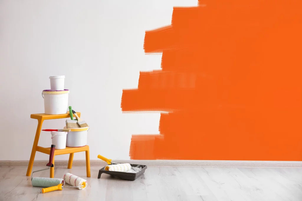
2. Consider Warm Colors: Warm colors, such as red, orange, and yellow, are known for their energizing and stimulating effects. They can create a cozy and inviting atmosphere, making them suitable for social spaces like living rooms or dining areas. However, it’s important to use warm colors in moderation as they can be overwhelming if used excessively.
3. Cool Colors: Cool colors like blue, green, and purple, are associated with calmness, relaxation, and serenity. They are nice in bedrooms, bathrooms, or any space where you want to promote a sense of tranquility. Lighter shades of cool colors can make a room feel more spacious, while darker hues can add depth and intimacy.
4. Balance with Accent Colors: Accent colors add visual interest and can be used to highlight specific areas or create focal points. While choosing accent colors, consider complementary color schemes. Complementary colors are opposite each other on the color wheel (e.g., blue and orange), while analogous colors are adjacent (e.g., blue and green). These combinations create a harmonious and balanced look.
5. Consider Personal Preferences: Although knowing the psychology of color provides general guidelines, personal preferences and individual associations with colors are important.
6. Lighting and Environment: Keep in mind that lighting and other environmental factors can influence the perception of color. Natural light, artificial lighting, and the surrounding decoration all impact the color appearance. To achieve the desired effects, consider these factors when selecting color.
7. Test and Experiment: It’s advisable to test paint on your walls at first. Paint a small area and observe how the color looks at different times of the day and under different lighting conditions. This will help you determine if the color creates the desired effect and if it harmonizes with the rest of the room.
Creating a harmonious home environment involves a combination of factors beyond color. Consider the overall design, furniture placement, lighting, and other decorative elements to achieve a cohesive and balanced space.
Lighting Colors
1. Warm white (2700K-3000K): Warm white lighting creates a cozy and intimate atmosphere. It’s often used in bedrooms, living rooms, and dining areas to promote relaxation and a sense of comfort.
2. Cool white (3500K-4100K): Cool white lighting has a more energizing and focused effect. It’s commonly used in kitchens, home offices, and task-oriented areas where clarity and concentration are important.
3. Daylight white (5000K-6500K): Daylight white lighting mimics natural daylight and provides a bright atmosphere. It’s suitable for areas where you need to stay alert and active, such as garages or laundry rooms.